Studio Sketchbook: Custom typeface for The Tuning Room
September 15, 2018 |Categorised in: Studio Sketchbook
Welcome to the first post in our Studio Sketchbook series! Here we’ll be focusing on concepts and ideas from our archive that didn’t see the light of day, but that we still believe are worth sharing.
Today we’re looking at an alternative route that was presented during the brand we conceptualised as part of our work with The Tuning Room.
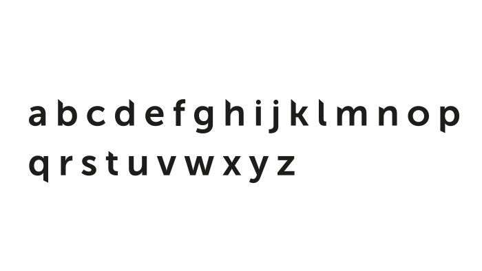

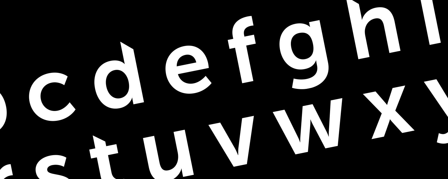
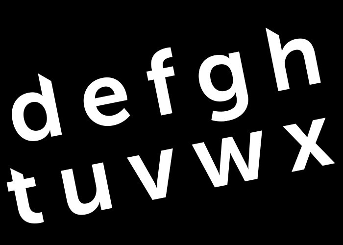
Our custom typeface was inspired by the chiropractic process that The Tuning Room specialise in – the idea that with fine adjustments, the body can be brought back into alignment to optimise performance.
This underlying principle became a central component of our concept for The Tuning Room. We represented the process of healing and optimisation with a misaligned typeface, which slowly becomes more legible as the eye scans from left to right.
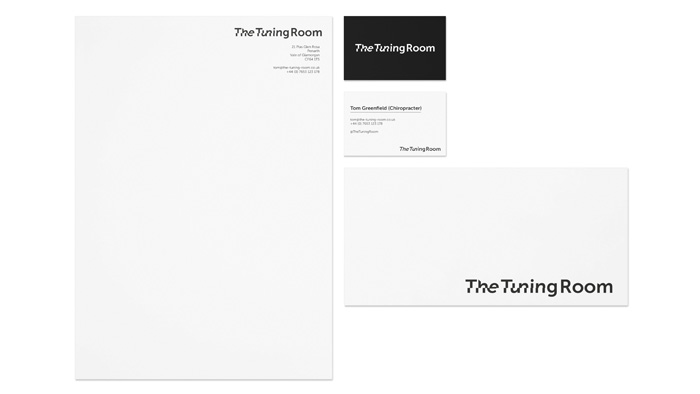
Not every idea makes the final cut, and The Tuning Room eventually chose a different direction for their brand. We always like to present clients with numerous options, collaborating with them until we’ve delivered an outstanding brand that matches the vision of the business.
View the final brand we produced for The Tuning Room in our portfolio.