February Inspiration: The Fleuron – A Journal of Typography
February 6, 2019 |Categorised in: Monthly Inspiration
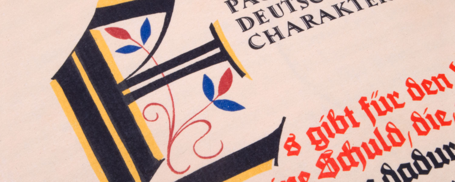
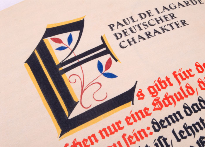
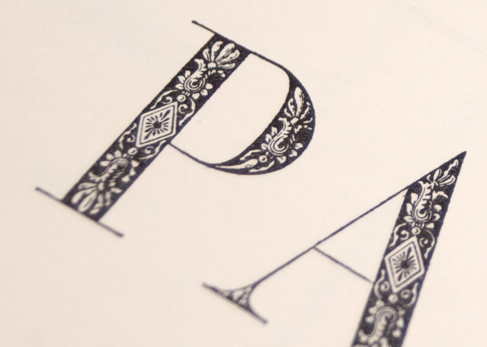
Edited by Stanley Morison and published across seven volumes from 1923 to 1930, The Fleuron was a British journal of typography which gained an international reputation for the quality of its articles and high production values. Each volume contains many different type specimens, paper stocks, illustrations, woodcuts and essays on typography from leading designers, typographers and graphic artists of the time.
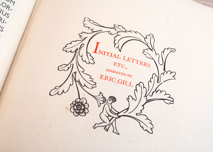
Some of the contributor’s names will be familiar to modern graphic designers to this day; Bruce Rogers, Claude Garamond, Eric Gill and Rudolf Koch to name but a few.
I was lucky enough to inherit all seven volumes from my Grandad who ran a family printing firm in Liverpool.
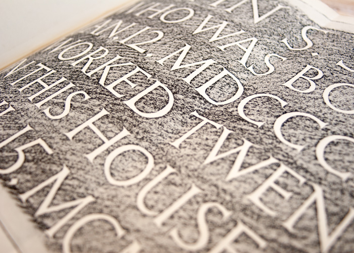
It’s a real delight to see the type specimens truly given space to breathe. Many are set over several pages using texts from famous literary works and interspersed with beautiful decorative illustrations, a far cry from the way we generally evaluate type today. It’s lovely way of showing off a typeface.
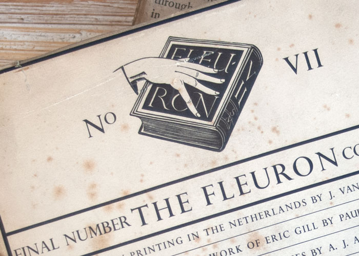
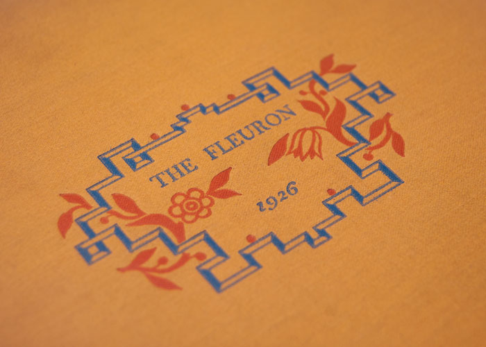

As physical objects the books are a delight to behold – lavishly printed and bound in full cloth and printed on a variety of paper stocks with over-sized pages and fold-outs. We’ve primarily focused our attention on the typography in the photos above but the colour plates remain astoundingly vibrant given the age of the books.
There’s plenty of inspiration here for the modern reader too – from ornate and decorative type arrangements to some wonderfully simple and stark woodcuts by Rudolf Koch.