What’s the best way to show web design concepts to clients?
August 23, 2018 |Categorised in: Ask The Designer
Although it’s common practice among designers, presenting static web design visuals has always felt a little jarring to us. The issue was brought into sharp focus last year during a particularly busy period in the studio.
We’d already completed a set of wireframes for the site, which had established a clear structure and informational hierarchy. As well as the wireframes we’d also created an almost full set of visuals for mobile, tablet and desktop views.
But after returning to the project after a brief pause in the work , we struggled. Despite the visuals designs being strong, it was a confusing and laborious process to sift through everything we’d created and the sheer number of visuals made it easy to get bogged down in the detail.
It was quite an eye opener. This is the position that we were putting our clients in every time we sent a PDF containing a set of static visuals to look at.
When we’ve been immersed in a project for weeks, everything makes perfect sense in our own heads. We tend to lose the ability to look at a piece of work as if we are seeing if for the first time, as clients are.
So, before we look at alternative options for presenting web design work, lets explore why PDFs of flat visuals can be so confusing for clients.
The problem with PDFs
The conceptual leap required to visualise a multi-page PDF as a finished website is enormous. If we – designers who were familiar with the wireframes – struggled so much, what hope would the client have?
When you stop to think it through, it really doesn’t make any sense at all. It’s a bit like sending someone a photo of a plate of food and asking them if they like the taste.
With the myriad of different sized devices we need to support, it’s practically impossible to accurately represent a website design outside of the context it will be viewed in. That of a web browser on a computer, tablet or phone screen.
For one thing, you very rarely see all of a webpage at once. You simply see whatever section happens to fit inside your viewport at any one given time.
It’s very hard to convey how an element with a fixed position will visually impact on a design that that won’t be completely static. Transitions, rollover effects, accordions and animations are also problematic.
The process of creating flat visuals in Photoshop or Illustrator doesn’t force you to think in a way that considers how a user will interact with a website. It can be all too easy to revert into a lazy design state, creating a set of pretty visuals that may end up lacking practicality and interactivity.
Put simply, a website is interactive. A flat set of visuals is not.
What are you trying to achieve?
Given the difficulties listed above, now is a good time to think about what you are actually trying to achieve with your web design concept.
The primary goal at this point is to build on the wireframes and establish a visual direction, look and feel for the project. We’re not trying to finalise anything yet – we’re simply aiming to get everyone on the same page in terms of the design we’re proposing.
If the aim is to simply provide a direction that both client and designer are happy with, presenting a full set of static visuals falls short. Doing so feels like you are presenting the client with a complete visualisation of the product. This makes it much harder for designers to change things as the build progresses, and the inevitable limitations of the design begin to make themselves known.
A better approach
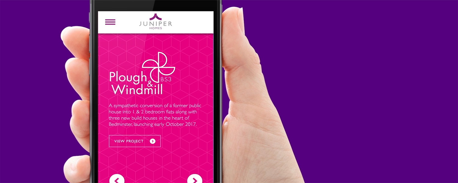
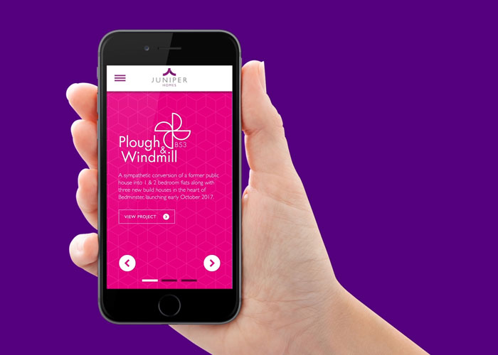
For the website project mentioned earlier, we felt it would be confusing to send the client a full set of visuals. A better approach, we decided, would be to animate user interactions on a few key pages of the site.
We did this for both desktop and mobile versions of the site, making it clear to the client that nothing was set in stone (the finer details would be developed and honed in-browser during the next phase of the project).
Here’s the animation we created for our client using After Effects:
While a few things changed and evolved along during the build, the overall look and feel of the final website is very similar to the design presented above (you can view the finished site here).
Animating user interactions for our client turned out to be a great exercise. As well as providing us with a simple tool to quickly convey our thinking, the very act of creating the animation forced us into the user’s shoes. It gave us a unique and invaluable perspective on the design – one that would have been impossible for us to achieve by creating a flat PDF of visuals in Photoshop or Illustrator.
Got a design-related problem that needs solving? Drop our friendly team of creatives a line today.