October Inspiration: International Designers Network magazine
October 23, 2018 |Categorised in: Monthly Inspiration
Welcome to the first post in our Monthly Inspiration series, where each member of our design team shares an item that’s been inspiring them.
It’s fair to say that the shackles have been off in the studio this month. Our new space in Canton is really starting to come together. We’ve also been working on some really fun and creative projects that have allowed us plenty of opportunity for exploration and experimentation.
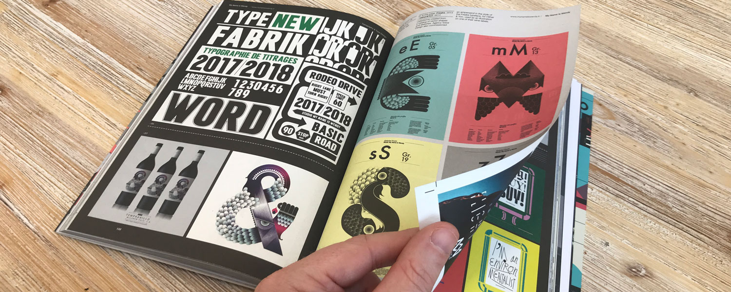
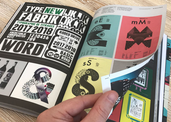
This month, our Monthly Inspiration picks come from the International Designers Network magazine. Our copy has been making its way around the studio with the enthusiasm of a group of toddlers passing around a huge bucket of sweets!
Hugh: My Name is Wendy
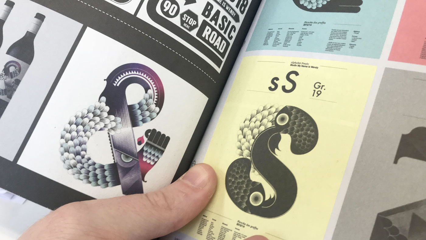
“Flicking through the magazine I was instantly drawn to the work by French studio My Name is Wendy. I just absolutely love the interplay between form and texture – the freaks alphabet is truly a thing of beauty.”
Rachel: Making Sense of Dyslexia
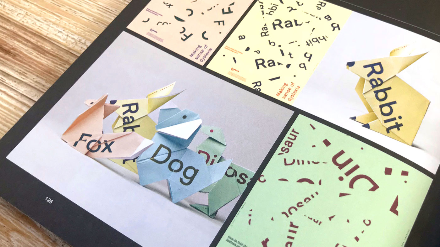
“I really love the playfulness and interactivity of this campaign by Ryan Atkinson. Rather than pasting a 2D poster on a wall in the hope it will increase awareness about something, it encourages people to rip off large peel-away pads and fold them up to reveal the true message behind the design.”
Tim: 3D Retro Alphabet
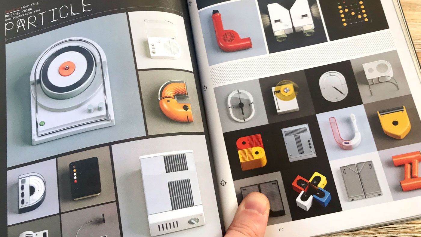
“This is great example of beautifully crafted 3D typography, created using Braun products. I love the simple retro-meets-modern look. It reminds me of one of my favourite projects on my foundation course, where I built a logotype using bike parts.”
Let us know what’s been inspiring you this month! Tweet us your favourites, tagging @TidyStudio.