Tell us a little bit about your new project.
Eat different
A changing industry calls for fresh new products. Recognising a growing need to offer options for health-conscious consumers, Peter’s Food Services tasked us with creating an eye-catching identity for their new range of low-fat baked snacks.
+ More Info +
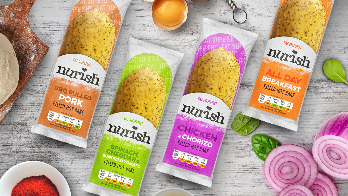
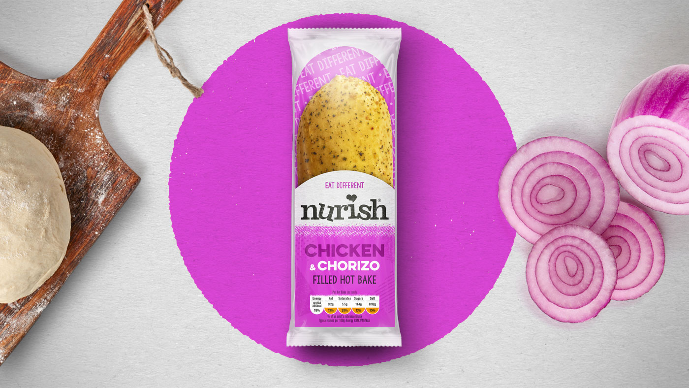
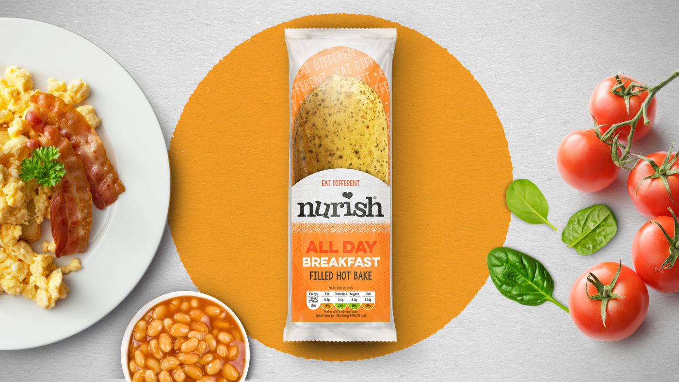
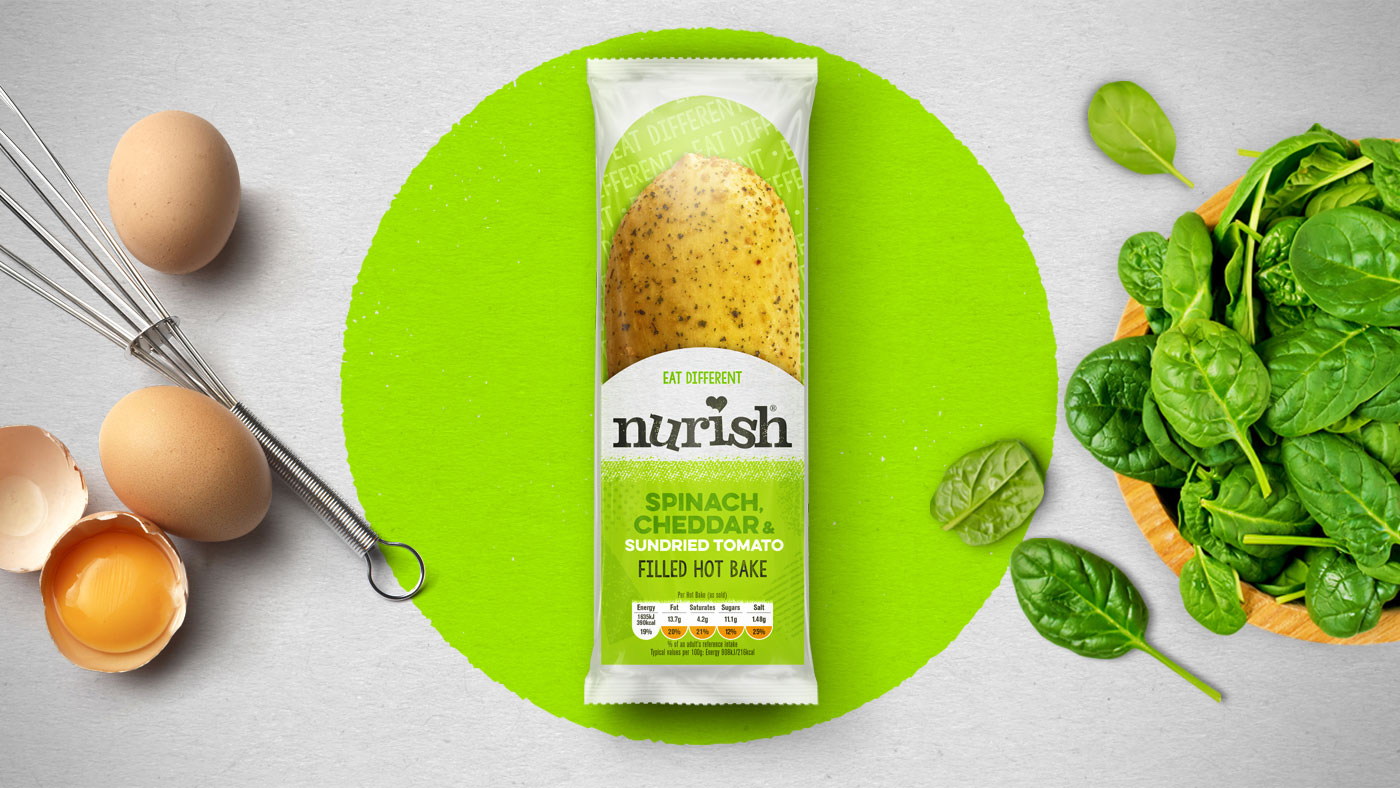
Our response was Nurish: a vibrant, youthful food brand appealing to on-the-go millennials.
Nurish needed to stand out on supermarket shelves, with unmissable packaging and tempting visuals. The packaging also needed to feature traffic light labelling, communicating the nutritional values of the new range.
In an increasingly crowded market of low-fat snacks, we wanted Nurish’s branding to offer something new and original, without detracting from the classic flavour combinations that our client had invested significant resources developing.
Combining vibrant pops of colour, playful typography and mouthwatering food photography, the visual identity we produced has helped Nurish to win its place on the shelves of selected Tesco stores. With plans for a new range of flavours and deals with other supermarket chains, the fresh-faced food brand is projecting a healthy forecast for years to come.
Art Direction, Branding, Logo Design, Packaging, Print
Sector: Food & Drink, Retail
Got an idea that needs some Tidy thinking? Let’s talk.
Call the studio on +44 (0) 2920 214 316 or drop us an email.