Tell us a little bit about your new project.
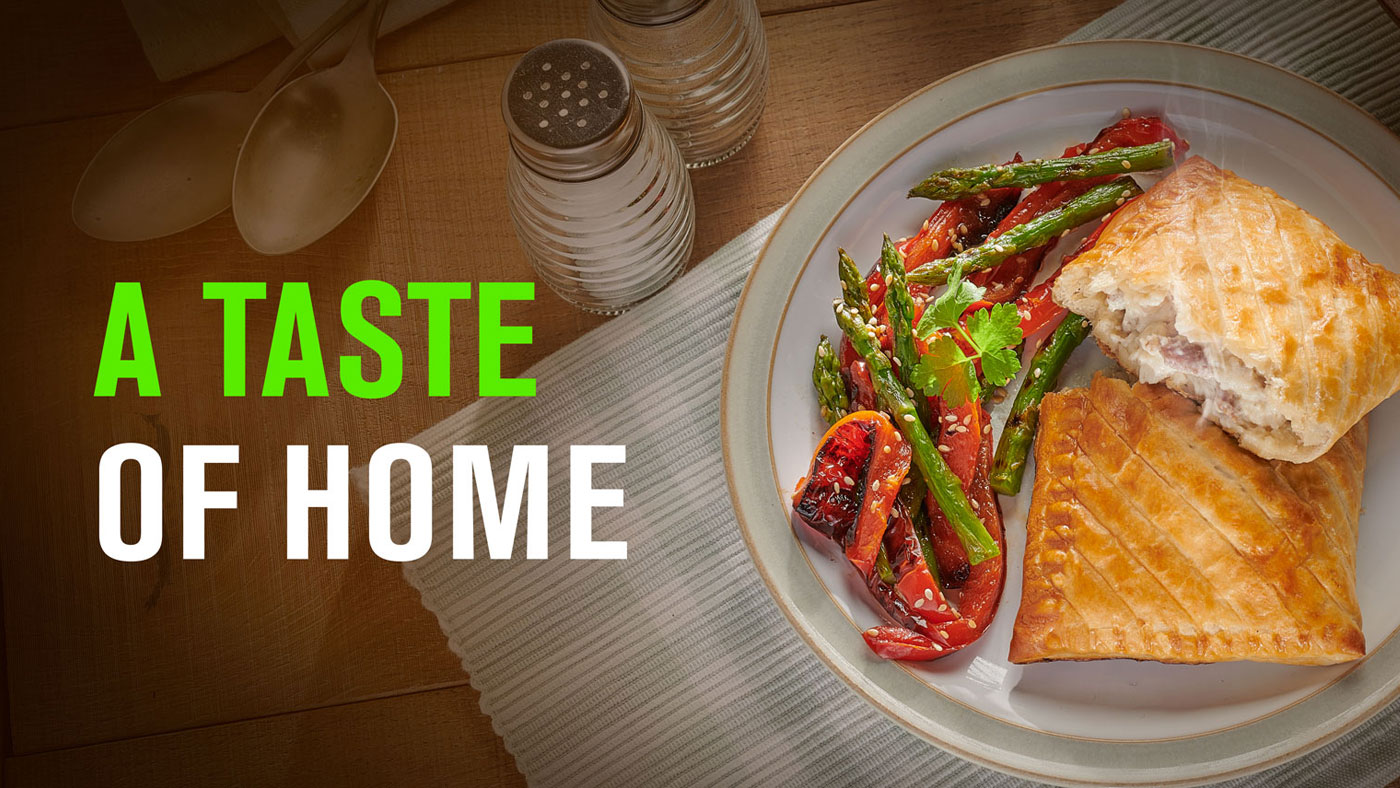
A taste of home
Caerphilly-based food business Peter’s has been a well-known family favourite in the world of savoury bakes for more than 50 years.
+ More Info +
This long-established company was ready to refresh its brand with a new look and feel for its products. However, in the process of rebranding, it was important to reassure loyal Peter’s customers that their favourite products would continue to taste as good as they always have.
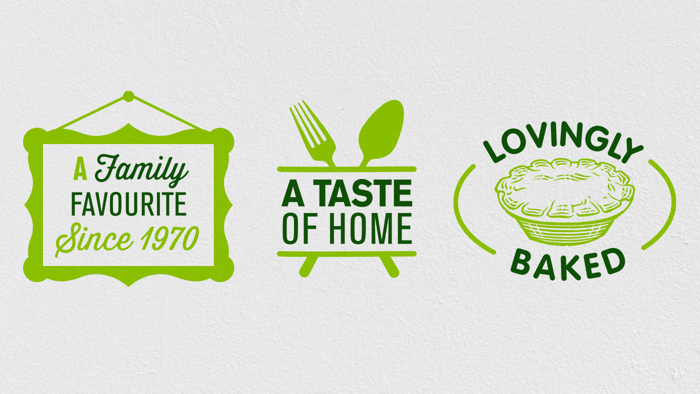
Honouring the past while looking to the future would be an important consideration when rebranding Peter’s – showing pride for the history of this homegrown business while simultaneously welcoming a new generation of customers into the family.
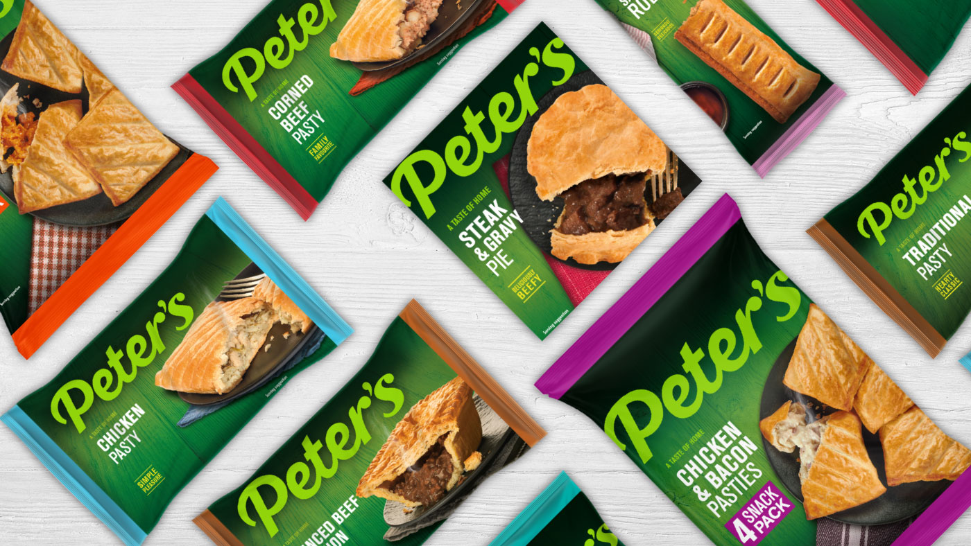
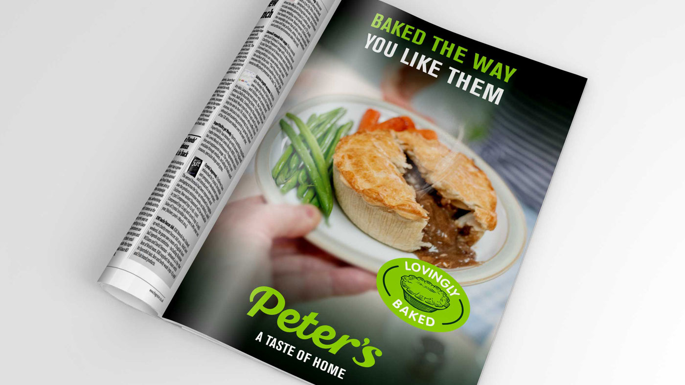
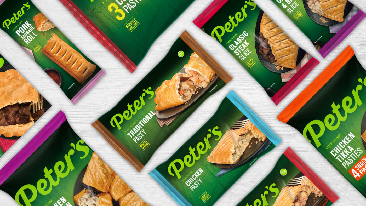
For this reason, we based Peter’s new brand around the colour green, a hue that’s been synonymous with its packaging for generations. New shades of green would revitalise the Peter’s image without losing its familiarity, alongside a clean, refreshed logo and a renewed focus on cosy family mealtimes throughout the brand.
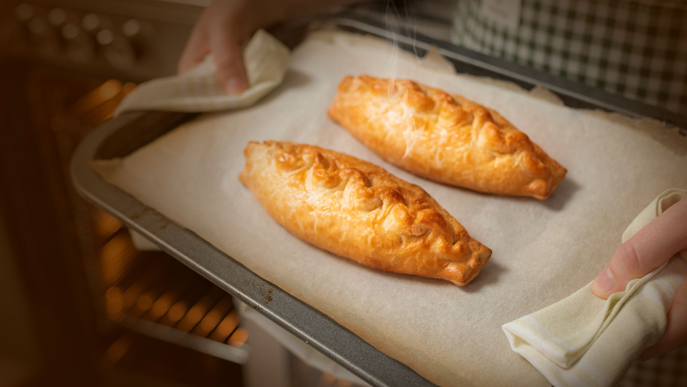
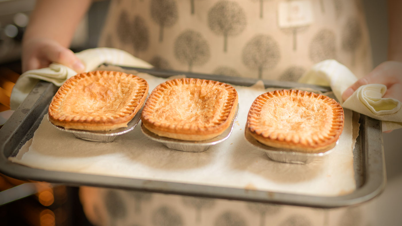
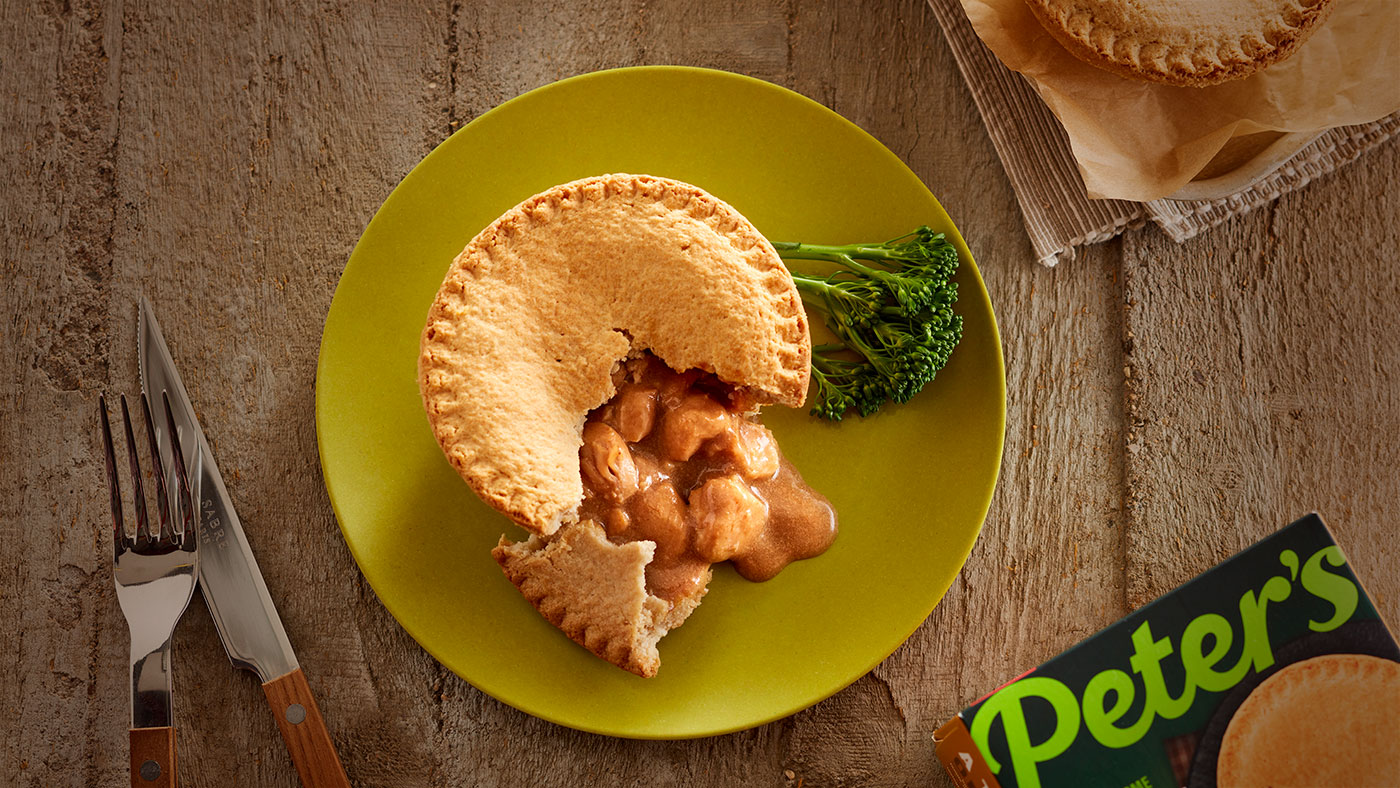
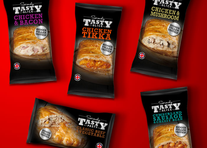
Peter’s classic pies, pastries and rolls have been given a fresh new look to match the future ambitions of the company.
With appetising food photography, revitalised packaging and a warm online presence, the business is equipped with a brand that’s aligned with its goals: to benefit the communities of customers it’s fed for generations, while continuing to serve up delicious baked goods to families and friends throughout the nation.
Art Direction, Branding, Logo Design, Packaging, Photography, Rebranding, Web Design
Sector: Food & Drink

Got an idea that needs some Tidy thinking? Let’s talk.
Call the studio on +44 (0) 2920 214 316 or drop us an email.