Tell us a little bit about your new project.
Promoting the power of print
A team of graphic print specialists based in Cardiff, Touch wanted to expand their business with a modern, scalable brand identity.
+ More Info +
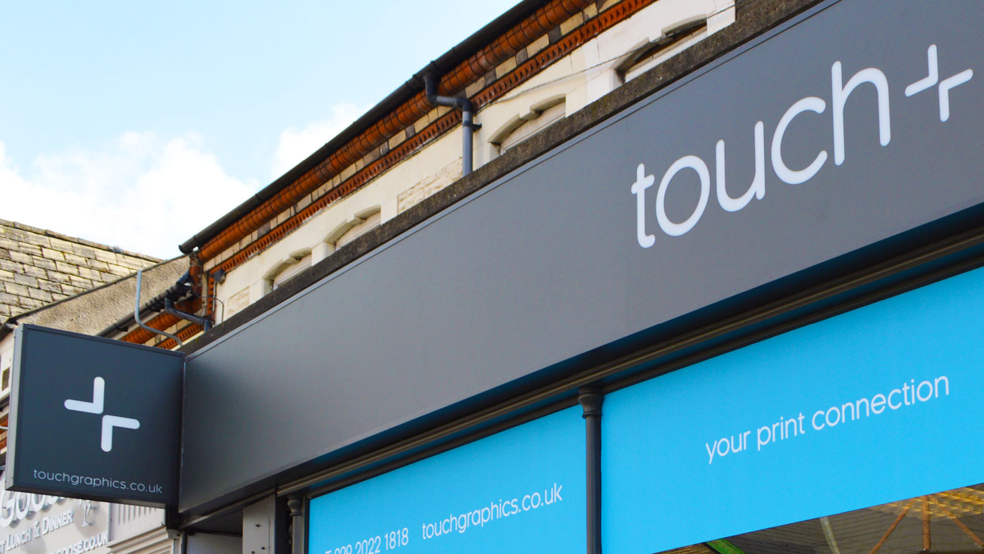
Tidy Studio was tasked with creating an original identity for Touch that could represent the company’s creative capabilities as well as its print services.
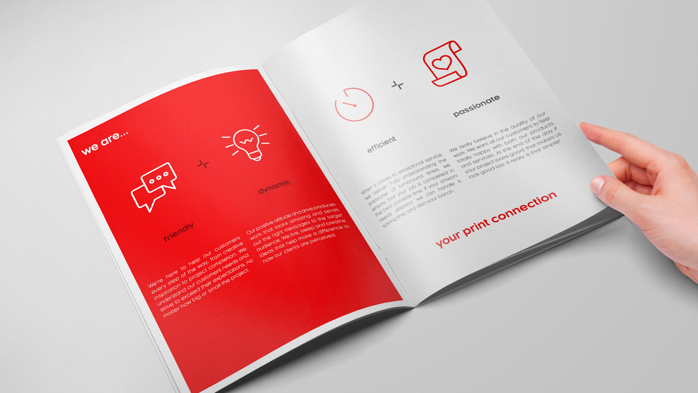
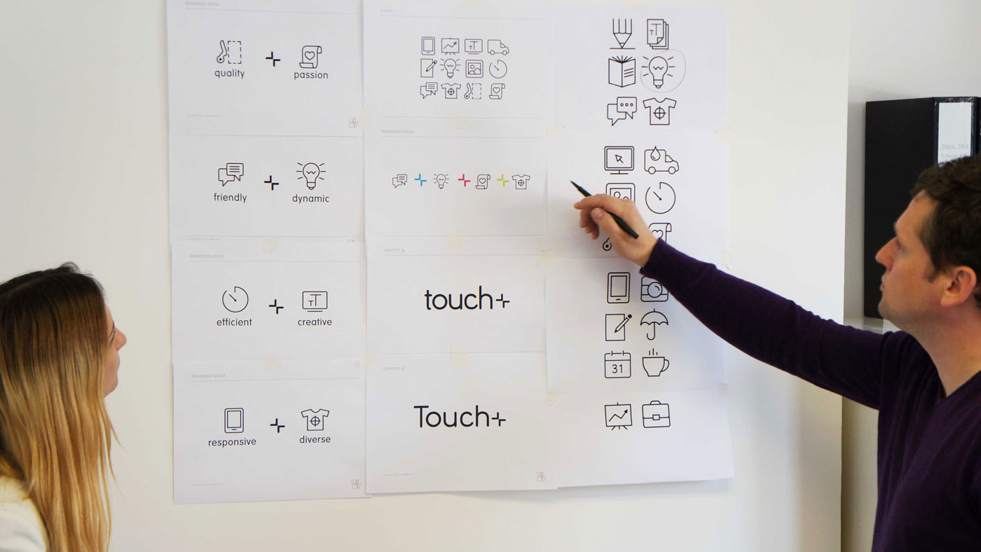
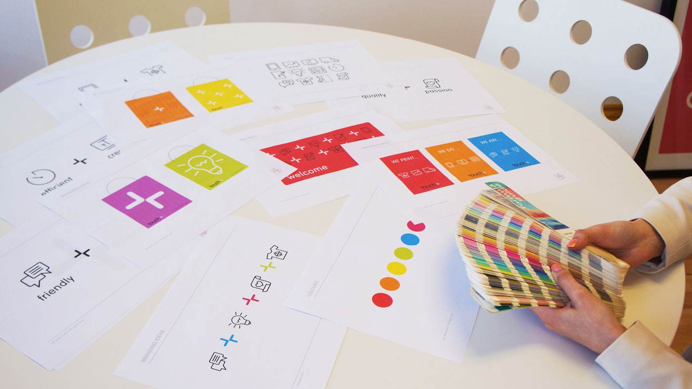
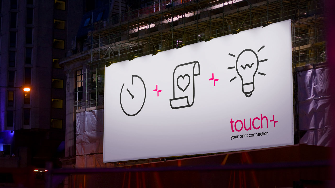
The branding process began by defining a set of core values – traits that Touch clients associate with their print supplier. We learned that quality, friendly, passionate, efficient and dynamic were all characteristics that needed to be reflected in the new brand.
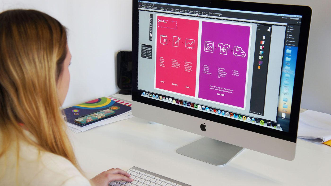
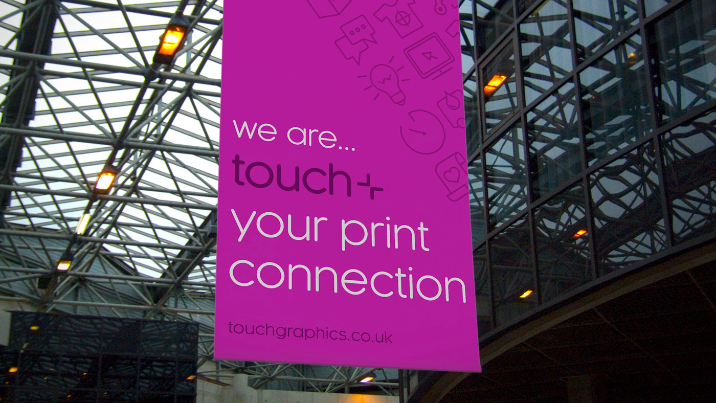
From these values, we defined a contemporary brand identity for Touch, incorporating rounded sans-serif type, a minimalistic logo, vectorised service icons and the core print colours of cyan, magenta and yellow.
Touch was presented with a fresh brand identity that reinvigorated its business, reflected its ongoing commitment to quality and accelerated the growth of its creative services.
Brand Strategy, Branding, Logo Design, Photography, Print, Rebranding, Video Production, Web Design
Sector: Retail


Got an idea that needs some Tidy thinking? Let’s talk.
Call the studio on +44 (0) 2920 214 316 or drop us an email.