
Tell us a little bit about your new project.
New look, same great taste
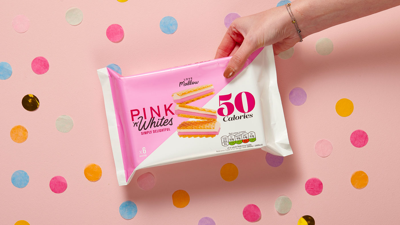
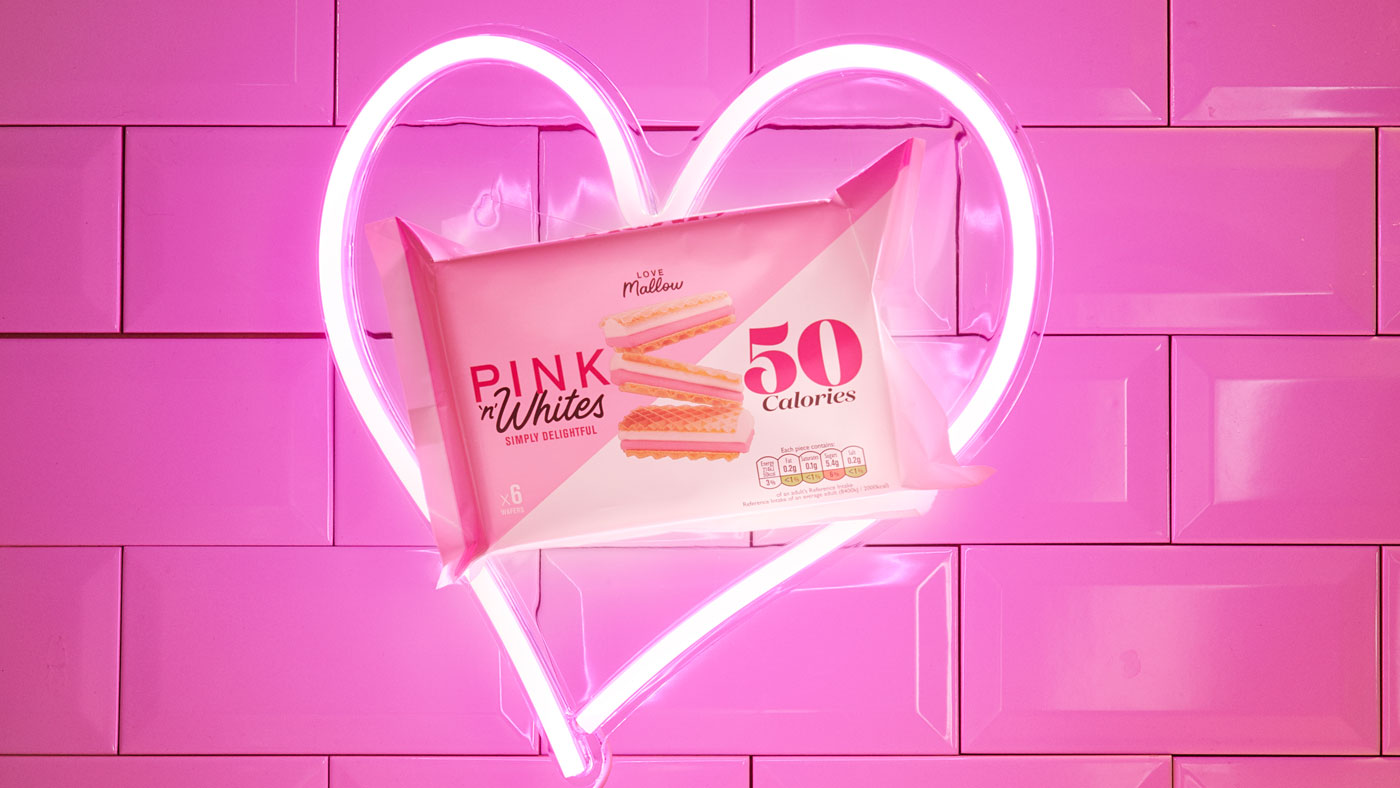
Having been around since the 1960s, Pink ’n’ Whites already had a distinctive and recognisable look for its product.
+ More Info +
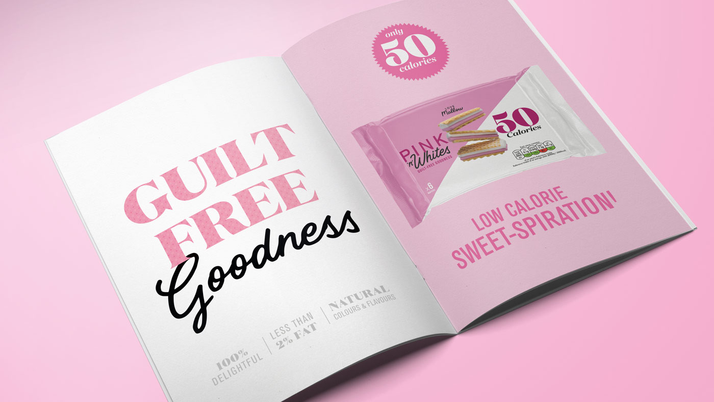
What these distinctive snacks needed was a fun and modern refresh, playing on the nostalgia of the product while emphasising its appeal as a tasty low calorie treat.
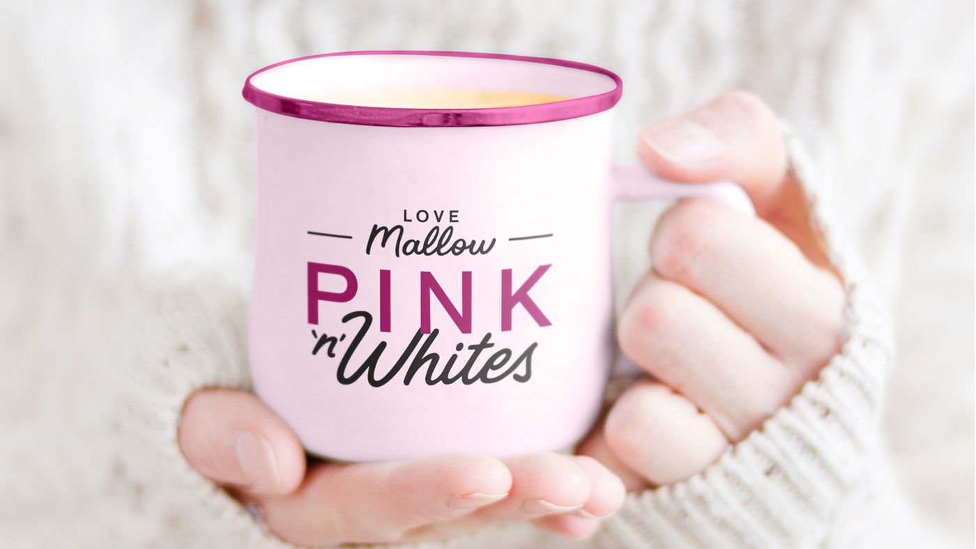
To maximise the attraction of the product for modern audiences, we elevated the Pink ’n’ White’s branding across multiple touchpoints, with deliverables including a new logo, packaging, website and social media image library.
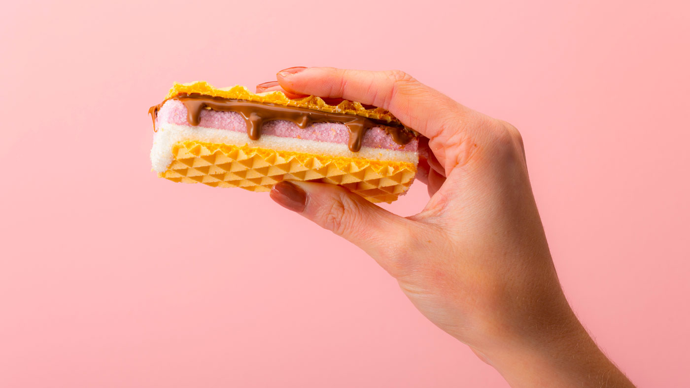
Fresh and fun product photography helped show off the funky aesthetic of this retro snack, dynamically shot to showcase its unmistakeable combo of crunchy biscuit and soft mallow filling.
By increasing the prominence of its key ’50 calories per wafer’ messaging on its packaging, website and other assets, Pink ’n’ Whites new brand has instant appeal for its audience of health-conscious snackers.
The original brand’s nostalgic charm is still front and centre, teaming up its well-known aesthetic with sleek modern typography and graphics to attract a new customer base of social media natives.
Advertising, Art Direction, Brand Refresh, Logo Design, Packaging, Packaging Design, Web Design
Sector: Food & Drink
Got an idea that needs some Tidy thinking? Let’s talk.
Call the studio on +44 (0) 2920 214 316 or drop us an email.