Tell us a little bit about your new project.
Find your flow
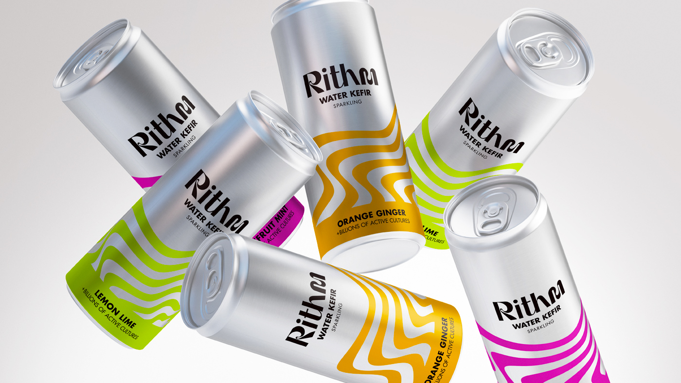
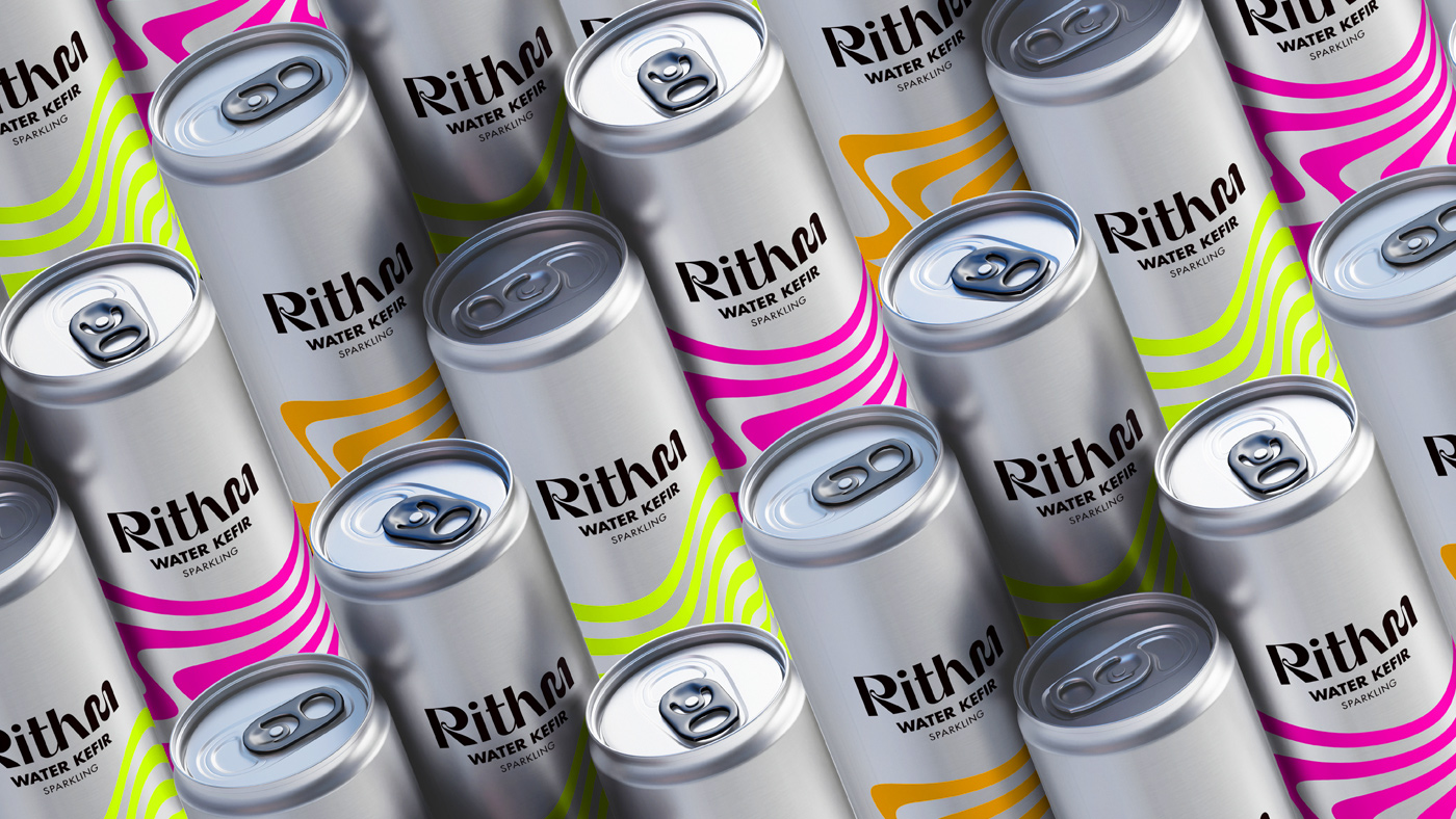
With refreshing products containing billions of gut-friendly bacteria that help both body and mind, we wanted the Rithm brand to embody the boundless energy that comes with finding your daily flow.
+ More Info +
We were approached by an ambitious entrepreneur with aspirations of taking water kefir to the masses. The new business would need a strategy, a name, a brand, and packaging designs for its range of microbiome-boosting beverages.
The project began with a series of in-depth workshops and putting into action our detailed, tried-and-tested strategic process. We spent considerable time crafting a solid foundation that would guide all creative and marketing decisions. This process included careful consideration of naming, brand positioning, tone of voice and visual identity, ensuring a cohesive and strong market entry.
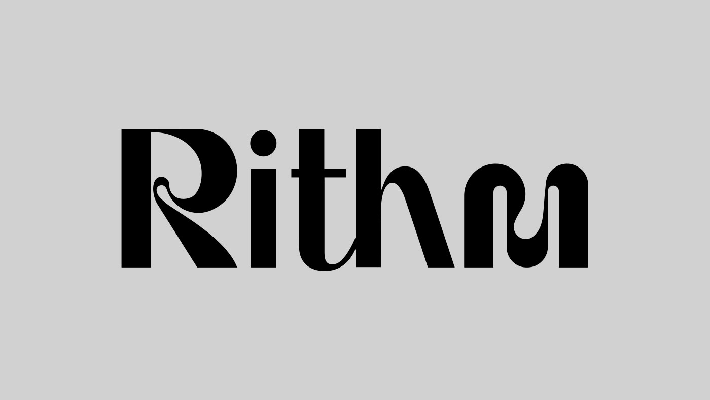
After several possible names were presented, the name Rithm, inspired by the flow state that helps high achievers perform their best work, was chosen. A playful reinterpretation of ‘rhythm’, it fulfilled our brief for a short, punchy name evoking movement and vitality that aligned with the brand-strategy.
Rithm breathes new life into the health drinks market with a brand that’s effortlessly effervescent. Organic wave motifs in bright colours adorn each aluminium can, bringing fresh energy to an everyday material while maintaining a cool, minimalist aesthetic.
Meanwhile, the distinctive Rithm wordmark embodies freedom of spirit with abstract, playful typography, channelling a nonconformist identity that suits an aspiring disruptor brand.
Brand Naming, Brand Strategy, Branding, Logo Design, Packaging, Typography
Sector: Drink, Food & Drink
Got an idea that needs some Tidy thinking? Let’s talk.
Call the studio on +44 (0) 7771 901110 or drop us an email.